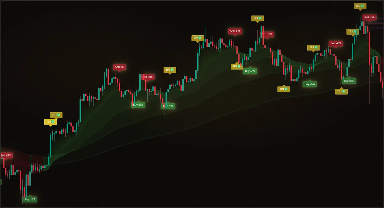
The candlestick chart was invented in Japan for rice trading, and it caught on because it conveys more information than a line chart. One candle tells not only where the market ended up, but also how it got there: a long body indicates a confident move, long shadows mean that the price was pushed in both directions and then brought back.
The color of the candle indicates the outcome of the period: a close above the open is usually shown as light or green, a close below - dark or red. By itself, this is not a signal, but by the alternation of colors and body sizes, it is possible to see who controlled the period.
Candles form patterns. For example, a candle with a small body and a long lower wick shows that sellers pushed price down before buyers returned it toward the open. Such patterns are useful only in context: the same candle at a strong level after a decline carries more information than it does in the middle of an uneventful sideways move.
Until a candle closes, its shape can change completely. A decision based on a 'nearly formed' pattern may rely on an image that ultimately never existed. Waiting for the candle to close prevents many of these errors.