
Why does the market respond to a zone rather than a thin line?
It is tempting to place the cursor exactly on a high and call that price resistance. In a real market, one participant submits a limit order, another closes a position, and a third waits for confirmation. Their decisions create an area, not a single pixel.
Zone width cannot be arbitrary. A practical starting point is the range of candle bodies and wicks around several reactions. The zone is narrower in a quiet market; with higher volatility, it is wider. Check the recent movement range with the ATR indicator, but ATR does not select a level or indicate direction.
Useful markup answers three questions:
- Where has price reacted more than once?
- How far did wick-throughs extend before price returned?
- Can you see the zone on the selected timeframe and the next higher timeframe?
Moving the boundary after every candle is a sign of overfitting. Keep one clear area and define the event that would invalidate the scenario in advance.
How levels are constructed: three distinct methods
Local extremes
A swing high is a local high surrounded by lower highs. A swing low is a local low surrounded by higher lows. An automated algorithm defines a number of candles to the left and right. The larger that number, the fewer and more significant the points.
The method has an explicit lag. A pivot requiring five candles to the right is confirmed only after those five candles appear. The marker is placed on the earlier extreme even though the algorithm could not know the outcome at that moment. It waits for additional data and then records a past fact.
Repeated price reactions
A manually drawn zone is built around several slowdowns, reversals, or accelerations. Two touches do not make it permanent. Consider the distance between reactions, their recency, the timeframe, and how price moved away from the area.
The more often a zone is tested in a short time, the more orders inside it may already have been filled. The phrase 'the fifth touch is stronger than the first' is therefore not a universal rule. A retest may confirm interest or exhaust it.
Calculated pivot points
Pivot Points Standard calculates a central P point and S and R levels from data for the selected period. In the Traditional formula, the basic calculation is:
P = (previous high + previous low + previous close) / 3
Support and resistance levels are derived from P. TradingView offers several formula types: Traditional, Fibonacci, Woodie, Classic, DM, and Camarilla. The type changes the lines, while a daily, weekly, or monthly period changes their scale. These levels do not have to align with swing zones.
How does automatic level plotting work?
An automatic tool usually has one of two foundations. One identifies local highs and lows within a candle window. The other calculates levels from the prior day, week, or month. Some scripts combine the approaches and add touches, volume, or zone width. In practice, a support and resistance indicator provides candidates for evaluation rather than completed markup.
The sensitivity setting changes the result. A small window marks many nearby points and quickly clutters the chart. A large window leaves only major reversals but confirms them later. No single value works equally well on one-minute and daily charts. A support and resistance indicator should therefore be evaluated only with fixed settings.
Testing begins with a clear protocol rather than a search for the 'best' period. Record the asset, timeframe, calculation type, and confirmation window. Then evaluate a consecutive series of completed observations without retuning after every unfavorable episode. This lets you compare the support and resistance indicator on consistent data.
Step-by-step chart setup
- Open one liquid instrument and select a working timeframe.
- Move one timeframe higher and mark the two or three nearest reaction zones.
- Return to your working chart and add automatic swing points or Pivot Points Standard.
- Compare where the automatic markers align with repeated reactions and where they appear independently.
- Set the zone width from actual candle bodies, wicks, and current volatility.
- Remove distant and duplicate lines that do not affect the current scenario.
- Write down the confirmation condition: a close beyond the boundary, a return to the zone, a reaction after the retest, or skipping the trade.
- Check at least 20 completed observations with unchanged settings.
For dynamic context, you can add a moving average. It may align with a static zone, but that alignment is not a guarantee. Bollinger Bands help show where price sits within a changing range. These tools answer different questions.
Rejection, breakout, or false breakout: three scenarios
Rejection
Price enters the area, fails to hold beyond the far boundary, and closes back inside. Subsequent candles move away from the zone. This confirms a rejection but does not guarantee a long move; a weak rejection can end in another test.
Breakout with retest
A candle closes beyond the zone, then price returns to it from the other side. Former resistance may become support, and former support may become resistance. The key word is 'may': the role change is confirmed by an actual reaction after the return, not by crossing the line alone.
False breakout
Price moves beyond the boundary but quickly returns inside without follow-through. This may be caused by a liquidity sweep, a volatility spike, or simply a failure to continue. A single long wick does not reveal participant motives, but it does show why acting before the candle closes is risky.
| Scenario | What is visible | What to check next |
|---|---|---|
| Rejection | the candle closed back away from the zone | continuation and distance to the next area |
| Breakout | the close held beyond the boundary | volume, volatility, retest |
| False breakout | price quickly returned inside | idea invalidation and a new balance |
What confirms a zone's strength?
The Volume indicator helps compare activity as price approaches and leaves the zone. High volume alone does not reveal which side prevailed. Read it with the candle close and follow-through. In this combination, the support and resistance indicator supplies only the area's location.
ATR shows the scale of recent price movement. When the average candle range rises sharply, a thin zone is more likely to produce wick-throughs. If volatility has contracted, the absence of a breakout does not mean one is necessarily close.
Momentum can be assessed with MACD, while oscillator extremes are covered in the guide to Overbought and oversold. Five similar indicators do not create five independent confirmations. Choose tools that measure different market properties.
A higher timeframe helps you avoid trading against the larger structure. Intraday resistance may sit in the middle of the daily range and matter less than it appears to on a zoomed-in chart.
Where are the levels in Midas?
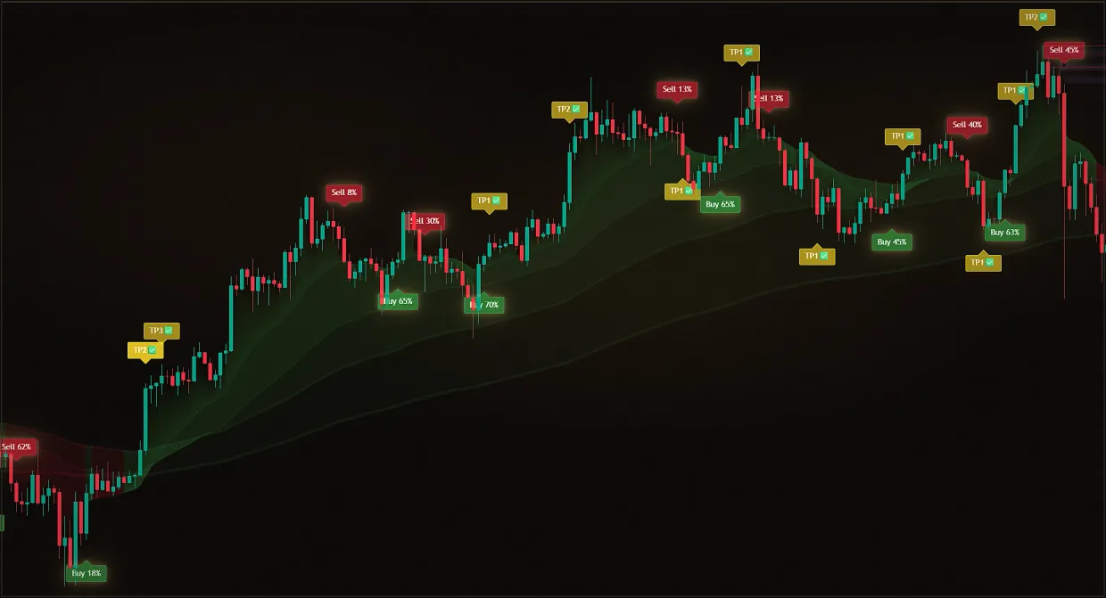
Midas Up provides direction and areas of interest. Its confirmed components include trend layers, support and resistance levels, a volume profile, and a liquidity map. The support and resistance indicator inside Midas should therefore be read as one layer of the broader context. Midas Down helps assess timing through money flow, impulse, a trend ribbon, volume delta, and an aggregate overbought or oversold reading.
Public sources do not disclose the formula for level strength, the weights, or the order in which the layers are combined. This article therefore does not invent coefficients or promise that alignment will automatically produce a result.
A Midas signal remains a cue to pay attention: open the chart, check the context, and make a decision according to your rules. It is not an instruction to enter a trade. A basic map of instrument classes is provided in the article on indicators for trading.
Five mistakes that make a level misleading
- Tick-perfect precision. The price can start a reaction within a wide area or pierce the boundary.
- Too many lines. When there is a level at every price, any outcome looks predicted in hindsight.
- Ignoring the delay. A swing marker on a previous high could only become known several candles later.
- Mixing scales. The daily pivot and the local five-minute extreme solve different problems.
- Entering on a single touch. A touch does not reveal whether price will reject, break out or continue through the zone.
Another trap is evaluating only successful examples. For an honest test, define the rules in advance and record every observation consecutively, including uneventful and failed cases.
Pre-decision checklist
- The zone can be seen in at least two independent reactions or calculated using a clear formula.
- The asset, working timeframe, and higher timeframe are specified.
- The near and far boundaries of the area are clear.
- The current candle has closed and its data is no longer changing.
- The scenario was defined in advance: rejection, breakout with a retest, or no action.
- Volume and volatility are read separately from direction.
- There is an idea invalidation point and a predefined risk.
- The settings were not changed after the outcome became known.
This sequence does not turn the level into a forecast. It makes the decision reproducible and helps identify which part of the logic worked or failed.
Risks and limitations
Automatic swing levels lag because they wait for candles to the right for confirmation. Classic pivot points depend on the formula, period, and set of sessions. A manually drawn zone depends on markup rules and is vulnerable to subjective overfitting.
Price may pass through a level without a retest, cross it several times, or open a new period with a gap. A stop order does not protect against slippage or a price gap. Agreement among several indicators does not rule out a false signal.
This material is educational and is not personalized investment advice. Indicators use historical data, lag, and can produce false signals. Past observations do not guarantee future performance. Test the rules on historical data and limit risk before using real funds.
Sources
Frequently asked questions
Is it better to draw a level as a line or a zone?
A zone is usually more useful for analysis. It accounts for the spread of candle bodies, wicks, and orders around earlier reactions. A thin line can serve as a midpoint or reference, but requiring a tick-perfect touch is usually too strict. Data providers also report slightly different extremes, so an exact line touch on one chart may not appear on another.
How many touches make a level strong?
There is no universal number. Consider recency, scale, the quality of the move away, and the market regime. A retest may confirm interest or fill remaining orders and weaken the area. Focus on reaction quality rather than the number of touches: how quickly and how far price moved away, and whether the latest reaction remained as strong.
What is a pivot point in simple terms?
A pivot point is calculated from prices in the previous period. In the Traditional formula, the central pivot is the mean of the previous high, low, and close, and S and R levels are derived from it. The rule is objective and appears automatically on the chart, but it is a calculated grid, not a place where the market must reverse.
Why did the swing level appear on a previous candle?
The algorithm waits for a defined number of candles to the right of the extreme. Only then can it confirm a local high or low, while the marker is placed back on the original candle. This marker is not a real-time signal: it appears after the confirming candles, which is an inherent property of the algorithm rather than a failure.
Does resistance always turn into support?
No. A change of role is only a working hypothesis until price actually holds the area and reacts on the return. Price may pass back through the area or never provide a retest. Treat it as a testable scenario: if price holds and rejects, the hypothesis is confirmed; if price passes through the area, the scenario is invalidated and should be abandoned.
On which timeframe should you look for levels?
Start with your working timeframe and one timeframe above it. The higher-timeframe chart shows the larger structure, while the lower-timeframe chart refines the scenario. Do not mix lines without labeling their timeframe. A simple rule is to draw levels on the higher-timeframe chart and transfer them to the working chart, not the other way around. This leaves a few important areas on the screen instead of dozens of lines from different timeframes.
Can levels be used with Midas?
Yes. Midas Up includes levels, their strength, trend, volume profile, and liquidity. Midas Down adds momentum and volume context. A signal is a reason to check the chart, not an automatic command. In practice, the level answers 'where,' while the system signal answers 'when to pay attention.' Define the idea's invalidation point and risk limit in advance.